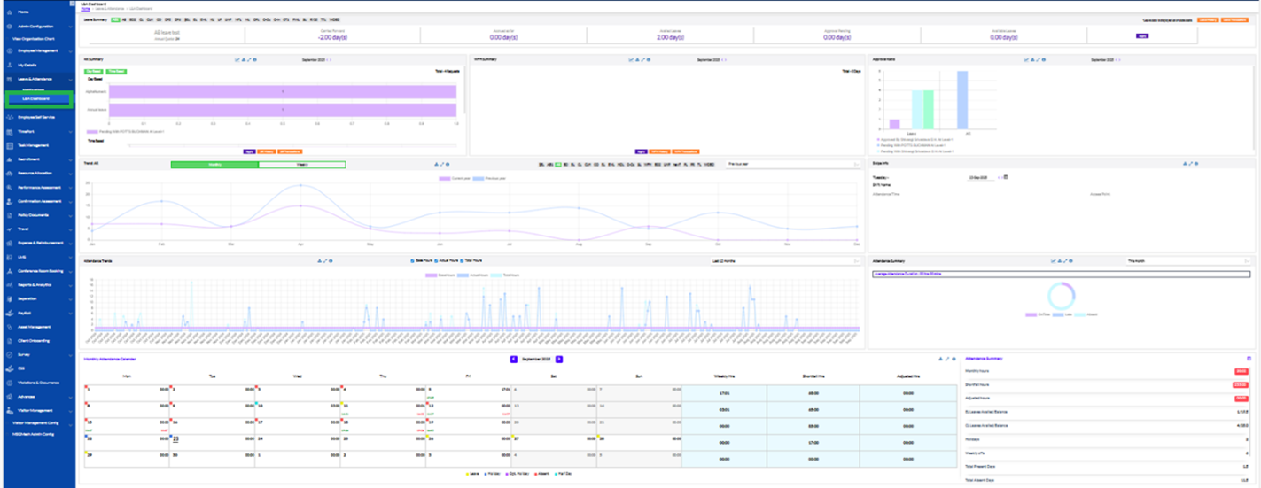
L&A Dashboard
2. Manager Dashboard
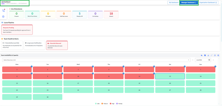
The Manager Dashboard enables managers to monitor attendance and leave-related information for their team members, including both direct reportees and indirect reportees reporting under the manager's hierarchy.
Features
Live Attendance Summary
Displays the current attendance status of team members, including Present, Work from Home, On Leave, Half-Day Leave, Weekly Off, On Holiday, Absent
Example:
If a manager has 25 employees reporting directly or indirectly, the dashboard may display: 15 Present, 2 Work from Home, 3 On Leave, 5 Absent
Leave Pipeline
Displays pending leave requests awaiting approval from team members.
Example:
If 4 employees have submitted leave requests that are pending approval, the dashboard displays:
"Requests Pending – You have 4 requests pending for approval."
Team Health & Alerts
Provides proactive notifications related to workforce well-being and attendance concerns.
Available alerts include.
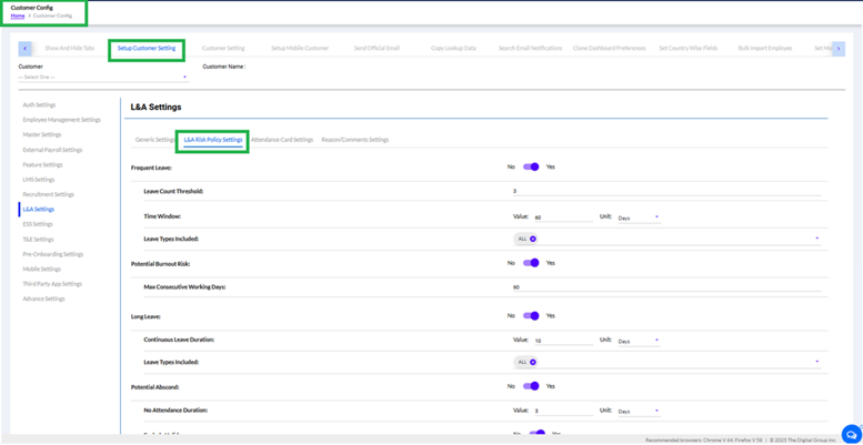
- Frequent leave: Displays how many employees has taken frequent leave. If the employee has taken leave for more than 3 times within 60
- Potential Burnout Risk – Identifies employees who may be at risk due to excessive workload or attendance patterns like if any employee has worked for more than 60 days without taking any leave will be considered as potential burnout risk.
- Long Leave Notification – Highlights employees currently on extended leave. If an employee is on leave for more than 10 consecutive days will be displayed under this type of alert.
- Potential Abscond – Identifies employees with prolonged unexplained absence patterns for more than 3 consecutive days. Example: If 5 employees have not reported to work for a prolonged period without approved leave, the dashboard displays: "5 Potential Abscond Cases Detected."
All of the listed above alerts are configurable through customer configuration as shown below:
Team Availability & Capacity Calendar
Displays team availability in a calendar format to assist workforce planning.
Color indicators:
- Green – Safe Availability
- Orange – Medium Availability
- Red – High Resource Constraint
- Purple – Holiday
Managers can:
- View workforce availability by date.
- Filter data by Business Unit.
- Identify resource shortages in advance.
Example:
If multiple team members are on leave during the first week of the month, those dates may appear in Red, indicating lower team availability.
The manager dashboard page contains more few tabs as shown in the image below:
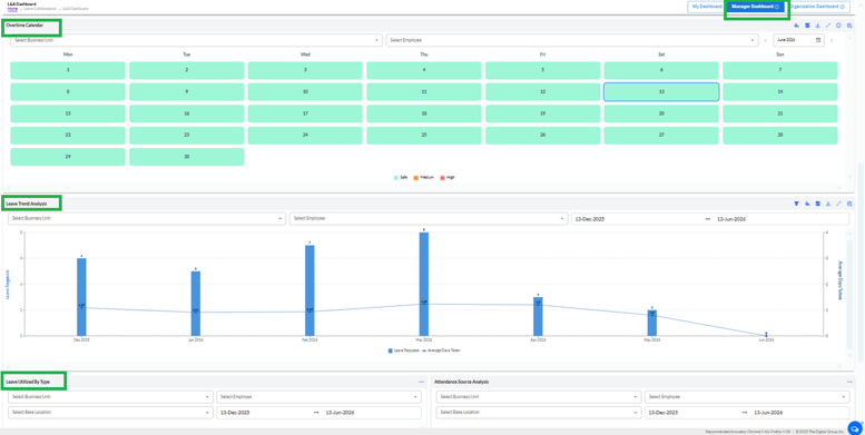
Overtime Calendar
The Overtime Calendar provides a day-wise overview of overtime workload distribution for team members.
Features: It displays overtime capacity status in a calendar format and allows filtering by: Business Unit, Employee and Month and Year. Also helps managers identify days with high overtime workload.
Color Indicators
- Green (Safe): Overtime levels are within acceptable limits.
- Orange (Medium): Moderate overtime workload.
- Red (High): High overtime workload requiring attention.
Example
If multiple employees have approved overtime on a particular day, the date may appear in Orange or Red, indicating increased overtime utilization.
Leave Trend Analysis
The Leave Trend Analysis widget provides a graphical representation of leave requests and average leave days utilized over a selected period.
Features: Displays: Total Leave Requests, Average Days Taken and allows filtering by: Business Unit, Employee, Date Range. It helps identify leave patterns and absenteeism trends.
Example
If an employee submits 8 leave requests during March and utilizes an average of 1.23 leave days per request, the chart displays:
- Bar Graph: 8 Leave Requests
- Trend Line: 1.23 Average Days Taken
Leave Utilized By Type
The Leave Utilized By Type widget provides a breakdown of leave consumption based on leave categories.
Features: It displays leave utilization by leave type, such as: Casual Leave,Sick, Leave, Earned Leave, Comp-Off, Leave Without Pay. It allows filtering by Business Unit, Base Location, Employee, Date Range .
Example
A manager can identify that a team member has utilized: 5 Sick Leaves, 3 Casual Leaves and 2 Earned Leaves during the selected period.
Attendance Source Analysis
The Attendance Source Analysis widget provides insights into attendance records captured through different attendance sources.
Features: It Displays attendance distribution based on attendance capture methods. It allows filtering by Business Unit, Base Location, Employee, Date Range.
Example
Attendance records may be categorized as:
- Biometric Device
- Mobile Attendance
- Web Check-In
- Access Card
This helps managers understand how attendance data is being captured across the team.
Dashboard Widget Actions
Each dashboard widget contains action icons in the upper-right corner that allow users to customize and manage widget data.
Filter Icon
Purpose: Applies additional filters to refine the displayed data.
Functionality
- Filter widget information based on available criteria.
- Helps narrow results for specific employees, business units, or date ranges.
Example
A manager can filter the Leave Trend Analysis chart to view leave requests for a single employee.
Customize Color Icon
Purpose: Allows users to customize the visual appearance of widget charts and graphs.

Functionality
- Modify chart color preferences.
- Improve visual distinction between different data series.
Example
A manager can change the Leave Requests bar color to improve dashboard readability.
Download Icon
Purpose: Downloads the widget data for offline analysis.
Functionality
- Export chart data.
- Save analytical information for reporting purposes.
Example
A manager can download Leave Trend Analysis data and include it in a monthly workforce report.
Refresh Icon
Purpose: Reloads the widget data with the latest available information.
Functionality
- Updates dashboard statistics.
- Retrieves newly processed attendance and leave records.
Example
After approving leave requests, the manager can refresh the dashboard to view updated counts.
Settings / Configure Icon
Purpose: Configures widget-specific display settings.
Functionality
- Customize widget behavior.
- Modify display preferences based on user requirements.
Example
A manager can configure default filters or display options for frequently viewed reports. Expand / Full-Screen Icon. It enlarges the widget for detailed analysis. It opens the widget in an expanded view. Provides better visibility for large datasets and charts. A manager can expand the Leave Trend Analysis chart to review monthly leave patterns in greater detail.
Note
The data displayed in the Manager Dashboard is limited to employees falling within the manager's reporting hierarchy, including both direct reportees and indirect reportees. Filters and dashboard actions apply only to the data visible within the manager's scope of access.
The Organization Dashboard provides a company-wide attendance and leave overview across all business units and departments within the organization.
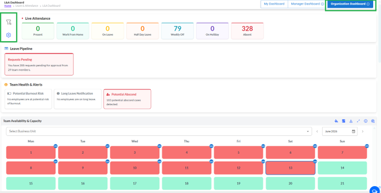
Features
Organization Attendance Summary
Displays overall employee attendance statistics for the entire organization.
Available metrics: Present, Work From, Home On Leave.
- Half-Day Leave
- Weekly Off
- On Holiday
- Absent
Example:
An organization with 500 employees may display:
- 344 Absent
- 55 Weekly Off
- 8 Present
- 0 Work From Home
The values represent attendance information for all employees included in the selected period.
Organization Leave Pipeline
Displays the total number of leave requests pending approval across the organization.
Example:
If 256 leave requests are awaiting approval from 29 employees, the dashboard displays:
"You have 256 requests pending for approval from 29 team members."
Organization Health & Alerts
Provides organization-wide visibility into employee attendance risks and workforce health indicators.
Available alerts:
- Potential Burnout Risk
- Long Leave Notification
- Potential Abscond
Example:
If 214 employees meet the configured abscond criteria, the dashboard displays:
"214 Potential Abscond Cases Detected."
Organization Availability & Capacity Calendar
Provides a consolidated workforce availability calendar across the organization.
Users can:
- View staffing availability across all departments.
- Filter data by Business Unit.
- Identify dates with high absenteeism or resource shortages.
- Support workforce planning and operational decisions.
Example:
If a large number of employees are absent during a specific week, those dates may be highlighted in Red, indicating reduced organizational capacity.
Key Difference Between Manager Dashboard and Organization Dashboard
| Dashboard | Data Scope |
| Manager Dashboard | Displays attendance and leave information for the manager's direct and indirect reportees only. |
| Organization Dashboard | Displays attendance and leave information for all employees across the organization. |
Example:
If a manager has 30 employees in their reporting hierarchy, the Manager Dashboard shows data only for those 30 employees. The Organization Dashboard shows attendance and leave information for all employees in the company.
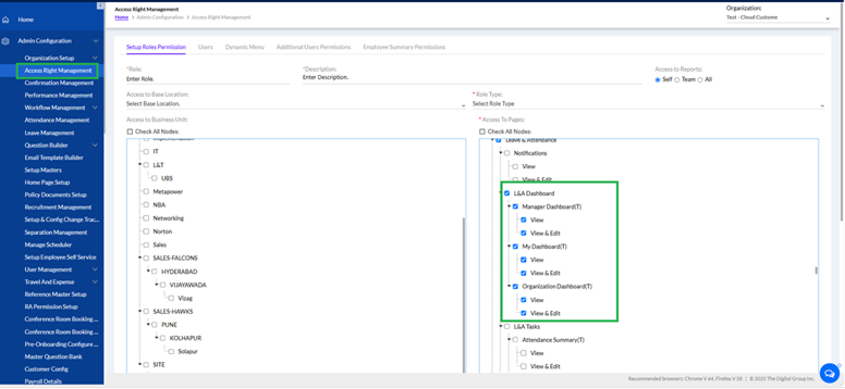
Note: The above dashboards can be configured through access right management as shown in the image below. The user can give access to all 3 tabs like if it is required to hide, unhide or view or edit the particular dashboard.